Brand design for contemporary architecture practice.
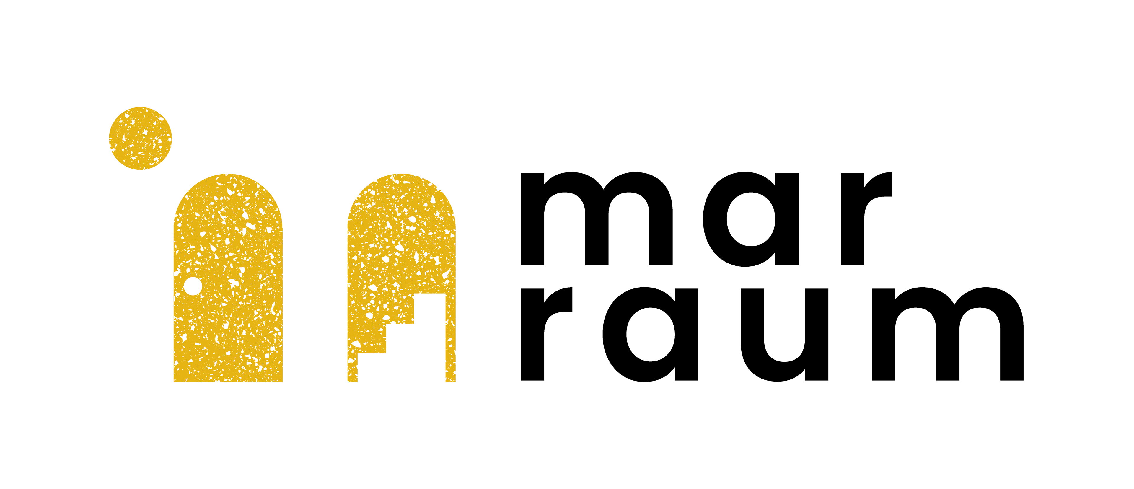
LOGO DESIGN
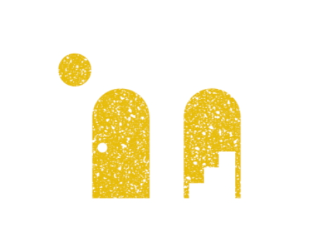
Twin doorways offer the beginning of a creative journey, an opportunity to tell your own story, in partnership with Marraum.
The doorways also describe the negative space of an M. The sun indicates the valley between the ascender and the shoulder.
The combination of textures references contemporary materials, creating a tactile, intimate feeling, which Daisy and Adam wanted to retain from the previous hand written logo.
The logo evolution is refined and given space to breathe.
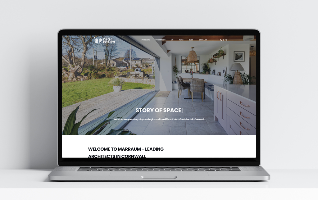
WEBSITE
Full bleed photography and overlaid minimal UI continue the feeling of light and space.
MOTION
Motion takes inspiration from the movement of the sun and how light moves in our homes.
IDENTITY TOOLKIT
A clean bold graphic toolkit which supports the logo and characterful illustration style.
